IBM PRODUCT IMAGERY SYSTEM
Designing order into IBM's product universe
CLIENT – IBM
PROJECT – IBM Product Imagery System
ROLE – Designer • Strategist • Author
CHALLENGE
IBM provides information about thousands of software products across its digital marketing ecosystem, but lacked a unified visual language to show these products. Although robust, the IBM Design Language (IDL) did not provide direction for product imagery either.
CONSIDERATIONS
Format: Although product imagery is used in multiple formats (static images, demos, webinars, tutorials, interactive widgets, product trials, etc.) we focused on static images.
Outdated product UI: Not all of IBM’s software products have been “Carbonized,” or designed in the Carbon Design System. Designers and strategists were hesitant to show outdated products that were aesthetically unappealing, overly busy and clashed with the Carbon design on the product page.
Audience: These product images catered to multiple audiences — the C-suite who decides to purchase the product, the practitioner who implements it, and the consumer who interacts with it.
GOAL
Provide a framework and inspiration for grounded decision making in the visual expressions of our products as well as empower designers with questions, prompts, and considerations for informed conversations with digital strategists and product teams.
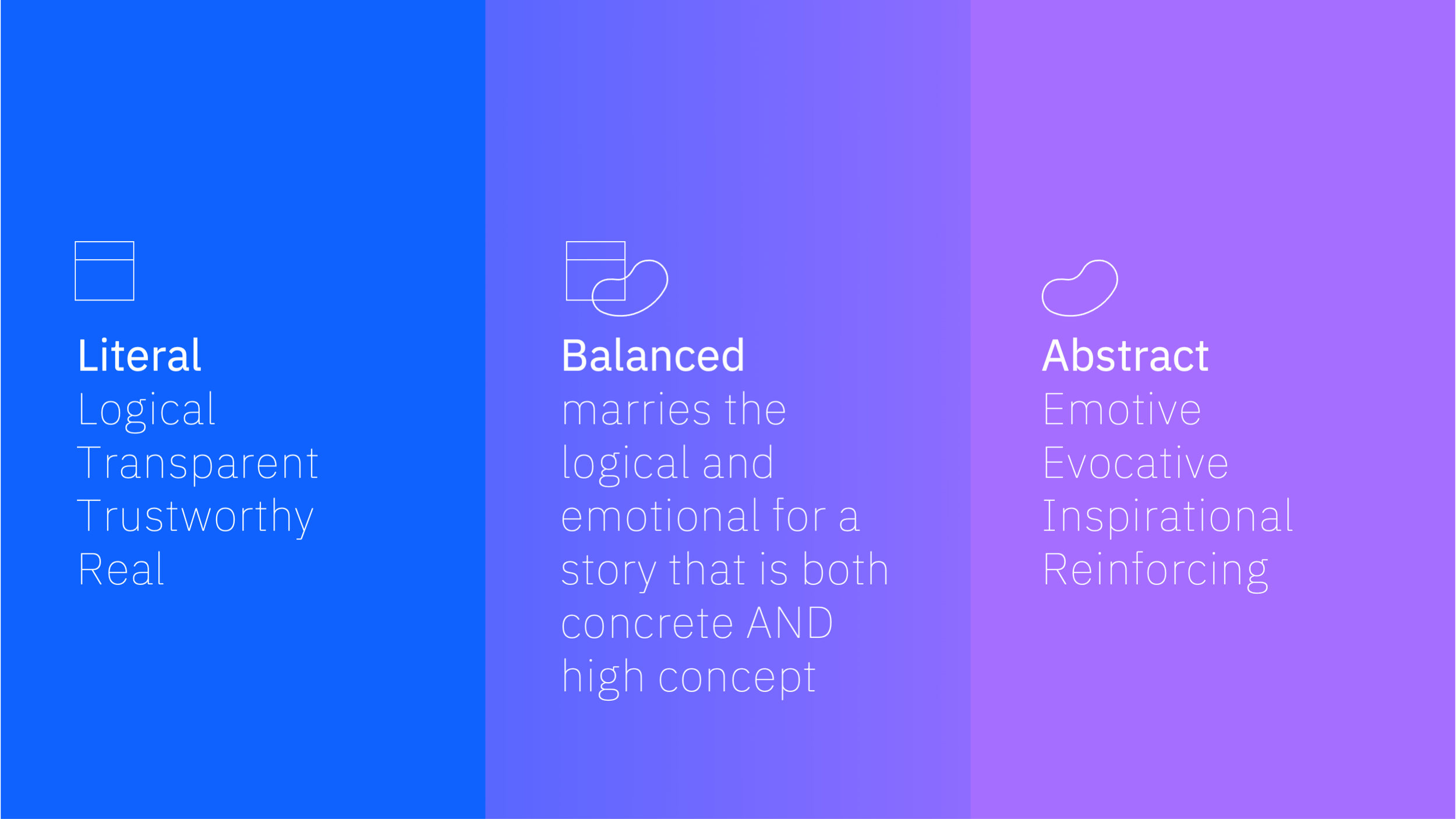
PRODUCT IMAGERY SPECTRUM
First, we conducted an audit of existing imagery and determined the need for a range of literal to abstract product expressions, from photographs of people interacting with the software in real environments to isometric illustrations. Then, we established a product imagery spectrum as a tool for designers to determine when to use which type of imagery. The examples at right demonstrate the spectrum in use with one of IBM’s products with robust imagery available, IBM Watson Assistant.
Additional design considerations included:
• Device frames (laptop, tablet, mobile)
• Strategic cropping to emphasize a specific feature
• Pop-outs to emphasize a specific feature
• Mix of element fidelity
• Collage elements
• Borders
• Drop shadows
PRODUCT IMAGERY GRID
Building upon the literal to abstract product spectrum (x-axis), we explored the stylistic range of expression within the IBM Design Language (y-axis.) These included single and multiple/collaged product images, and flat, line and isometric illustrations.
SOLUTION
We identified an ideal hybrid UI expression that launched a new style of product imagery in the leadspaces of the product pages we were migrating. Finally, we compiled all of the research and work into a presentation for the design team and codified it for a broader audience on the IBM.com documentation site.