GATHER CUSTOM INFOGRAPHICS
BUILDING TOOLS WITH AI FOR WORKFLOW EFFICIENCY
CLIENT – Gather
PROJECT – Infographics Tool
ROLE – Design & Dev
CHALLENGE
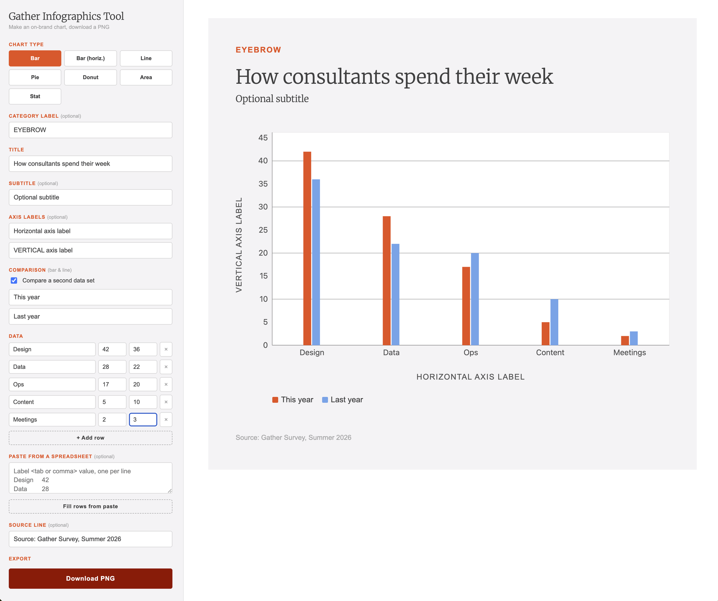
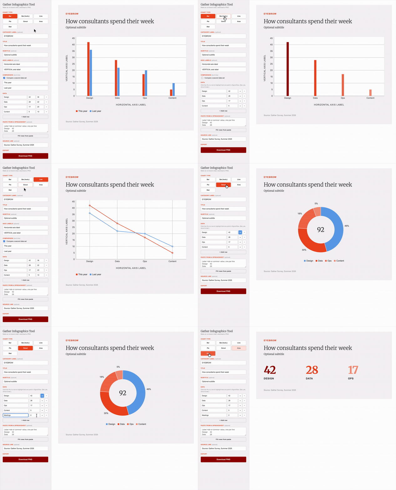
Gather is a collective of independent consultants, with many teams who need assets (website, pitch decks, white papers, The Gather Signal podcast). Since most of these assets are created/published without design resources, I wanted to create a tool for the Gather community to produce on-brand assets. Infographics are an asset type that are used frequently but are time-intensive to create.
CONSIDERATIONS
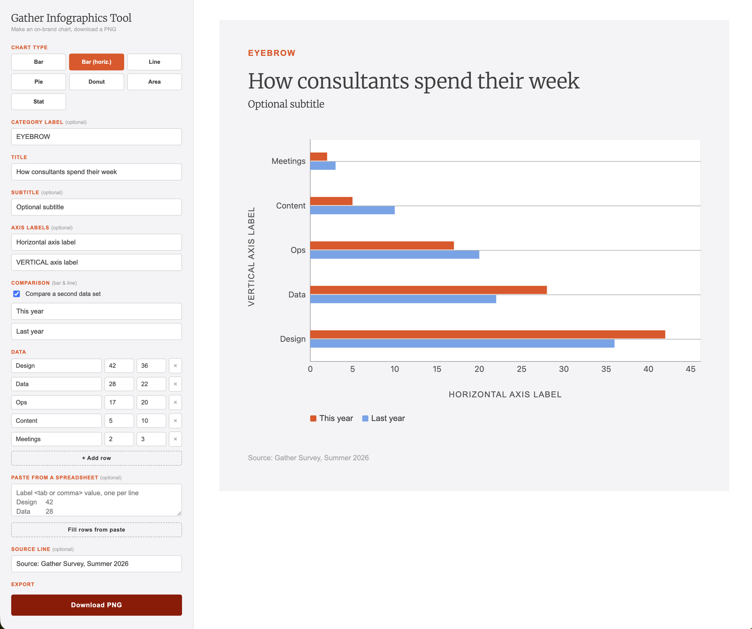
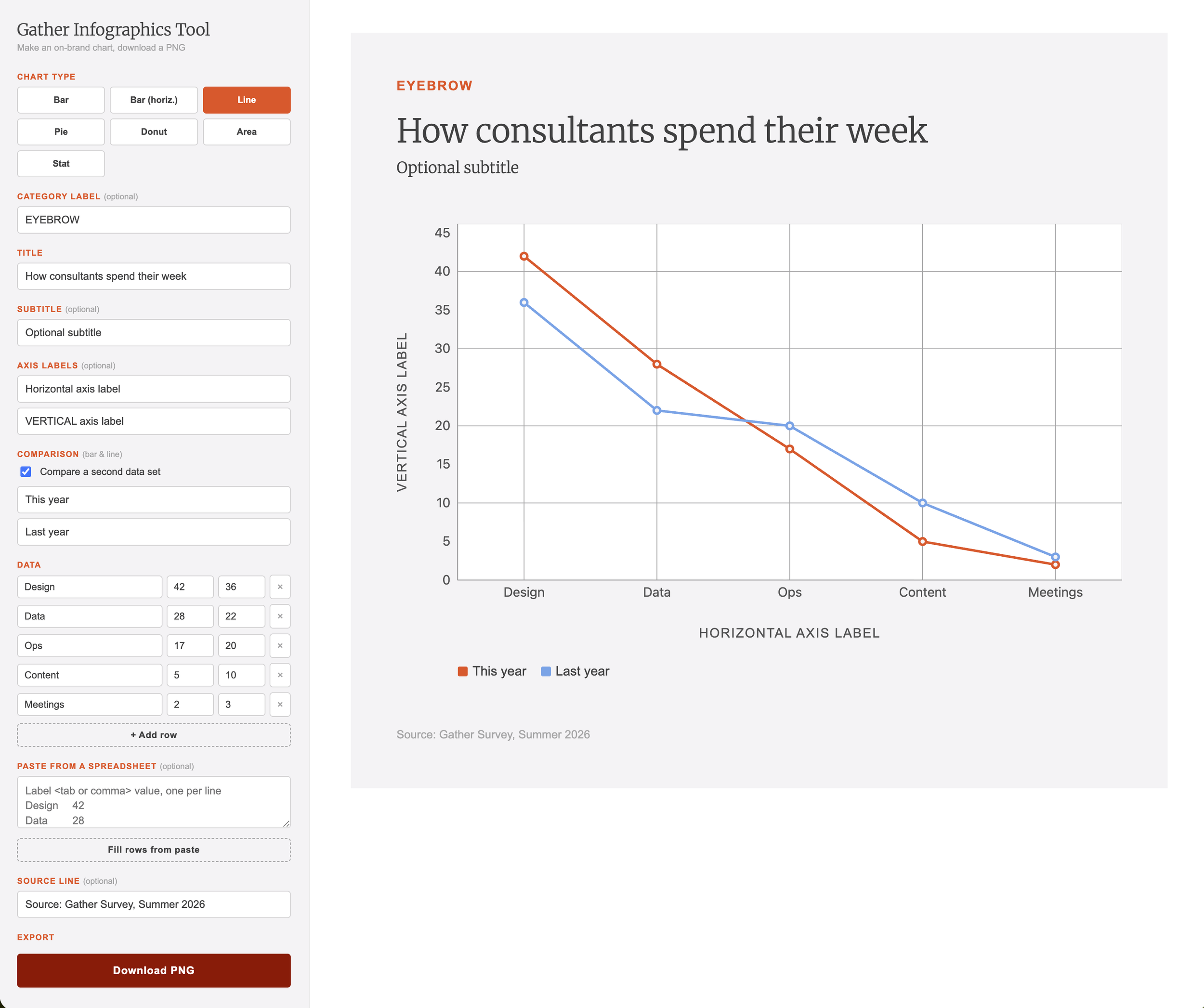
Ease of use: Senior practitioners with limited time needed to go from data to finished chart in a minute or two. No login, no install, no learning curve. They can paste data from a spreadsheet, pick a chart type, and download a PNG.
On-brand by default: The palette, typography, and color logic are built into the tool, so brand compliance isn't something a user has to remember or a designer has to review.
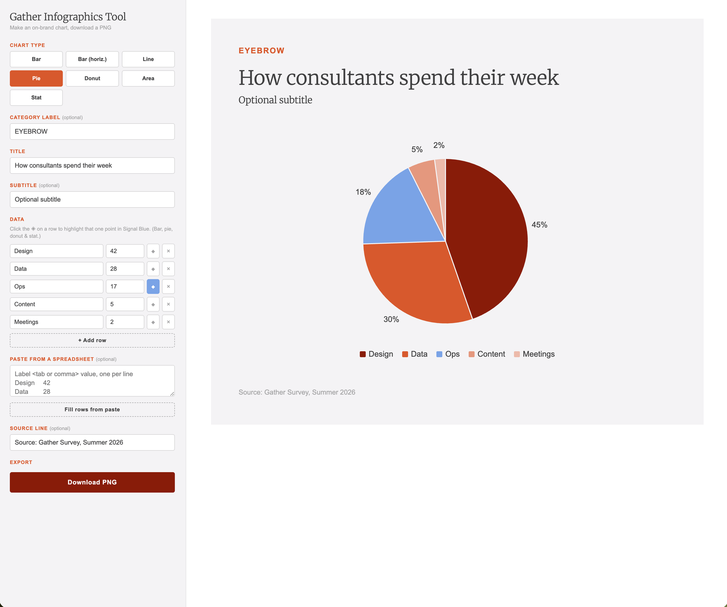
Extending the brand palette: Gather's palette was built for identity, not data. Its single brand orange didn't carry a five-category chart, so I expanded that primary orange into a six-step tint ramp. Categorical data stays distinguishable and on-brand, with the secondary blue working exclusively as an accent for the data point a story needs to emphasize.
Legibility as a constraint: Charts are read on phones and embedded in articles at small sizes. Type sizes, line weights, and grid contrast were adjusted for that condition rather than the desktop view.
DEVELOPMENT
I built this with Claude Code, iterating the design and code together rather than handing off between them. It's a single page hosted on GitHub Pages, so the deliverable is a link anyone in the community can bookmark and use immediately.